MadonnaTribe meets Jeri Heiden
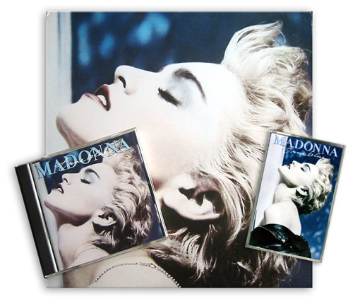
Here’s another exclusive chat from the original “MadonnaTribe meets” series of interviews and Q&A’s. To keep celebrating the 20th anniversary of True Blue, we met Jeri Heiden, the woman in charge of the cover design of many Madonna albums, among them, Like A Virgin, Like A Prayer, You Can Dance and True Blue, for a talk about the making of that Iconic cover. Here’s a short passage from the interview. Click on image below to read it in full.
Jeri Heiden: I was working in the art department at Warner Bros. at the time – on staff as an Art Director. At that time, most artists worked with us in-house.
Madonna had commissioned the Herb Ritts photo shoot – she was already highly aware of the value of her image and was in control of it. The photo shoot was given to me to edit – it was at least 60 rolls, mostly 35 mm.
Good thing my eyesight was strong back then! I edited the session and made recommendations for prints. We ordered about 30 or 40 test prints from Herb’s studio.
Other than that, there was no specific idea for the cover.
MadonnaTribe: The back cover of the album presents the song titles written in Madonna’s handwriting. It’s funny as her latest album Confessions On A Dance Floor has the titles written in the same way. Whose idea was to write the titles that way on True Blue?
Jeri Heiden: Sorry if I am busting a myth – but that’s my handwriting! I have used my own handwriting on numerous albums, and have had several different fonts created from it.
So… I guess it was my idea.
MadonnaTribe: Talk about busting a myth, indeed!
Speaking of the front image, there are two different versions of the True Blue cover, there are copies printed in Canada and the U.S. that just have Madonna’s face with no logos.
Other copies released in the UK and Europe had the Madonna logo and album title on top. Is there a reason for this?
Jeri Heiden: We used a sticker in the U.S. – thinking it would be really cool if when you took off the shrink-wrap there was nothing left but the gorgeous photo of Madonna. It was so iconic.
Other territories were less confident I suppose, and felt that her name HAD to be on the cover. This isn’t unusual at all – for territories to modify artwork for their needs. I remember providing International with the alternate cover.
MadonnaTribe: The cassette version of True Blue presented the full Herb Ritts image while the vinyl album cover had the face close up. Was it hard to crop that powerful image to fit the square size of the vinyl cover?
Jeri Heiden: No, not really. I think the image became more interesting cropped into a square – and at that time we always started with the album cover configuration.
It was like she was floating – her clothing was not visible. She took on the appearance of a marble statue – Goddess like.


