Celebrating True Blue with Jeri Heiden
This July Madonna‘s most Iconic and Pop album, True Blue celebrates its 25th anniversary.
A few years back we spoke to Jeri Heiden, the woman in charge of the artwork of that amazing album cover. Here are a few Q&A from that interview, that you can read in full by clicking HERE.
MadonnaTribe: Jeri, the back cover of the album presents the song titles written in Madonna’s handwriting. It’s funny as her album Confessions On A Dance Floor has the titles written in the same way. Whose idea was to write the titles that way on True Blue?
Jeri Heiden: Sorry if I am busting a myth – but that’s my handwriting!
I have used my own handwriting on numerous albums, and have had several different fonts created from it.
So… I guess it was my idea.
MadonnaTribe: Talk about busting a myth, indeed!
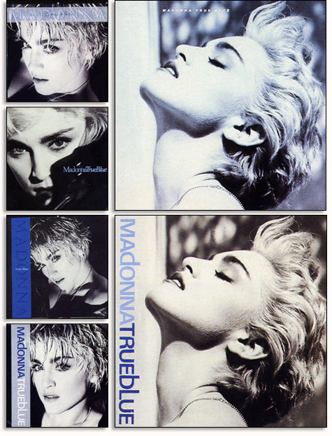
Speaking of the front image, there are two different versions of the True Blue cover, there are copies printed in Canada and the U.S. that just have Madonna’s face with no logos.
Other copies released in the UK and Europe had the Madonna logo and album title on top. Is there a reason for this?
Jeri Heiden: We used a sticker in the U.S. – thinking it would be really cool if when you took off the shrink-wrap there was nothing left but the gorgeous photo of Madonna. It was so iconic.
Other territories were less confident I suppose, and felt that her name HAD to be on the cover. This isn’t unusual at all – for territories to modify artwork for their needs. I remember providing International with the alternate cover.
MadonnaTribe: The cassette version of True Blue presented the full Herb Ritts image while the vinyl album cover had the face close up. Was it hard to crop that powerful image to fit the square size of the vinyl cover?
Jeri Heiden: No, not really. I think the image became more interesting cropped into a square – and at that time we always started with the album cover configuration.
It was like she was floating – her clothing was not visible. She took on the appearance of a marble statue – Goddess like.
In the vertical cropping you see her leather jacket and the wall, and it becomes more typical, editorial, earthly.
MadonnaTribe: From what we hear, the original Herb Ritts photo was in black and white that was then hand tinted with blue tones. Can you tell us more about the process the led to the final result?
Jeri Heiden: That’s correct. The image was a 35mm b&w shot. I experimented with a variety of treatments, looking for a good compliment to the album title.

