The Muddled Immaculate Super Heavyweight Collection!
You may have seen from an earlier Fact of the Day that Madonna’s second collection of hits ‘GHV2‘ was originally conceived with a different name and a different tracklisting.
Regular readers of this thread might not be too surprised to find that her first hits collection ‘The Immaculate Collection‘ went through similar reversions right up until release as well!
Firstly the name ‘The Ultimate Collection‘ was scrapped in favour of the now familiar ‘The Immaculate Collection‘. Why this was changed is unknown, but it was changed too late to notify the UK chain of Sam Goody stores who listed it on their catalogue for years to follow, together with a video collection of the same name – causing collectors no end of headaches trying to order and hunt down these elusive (an non-existant) releases.
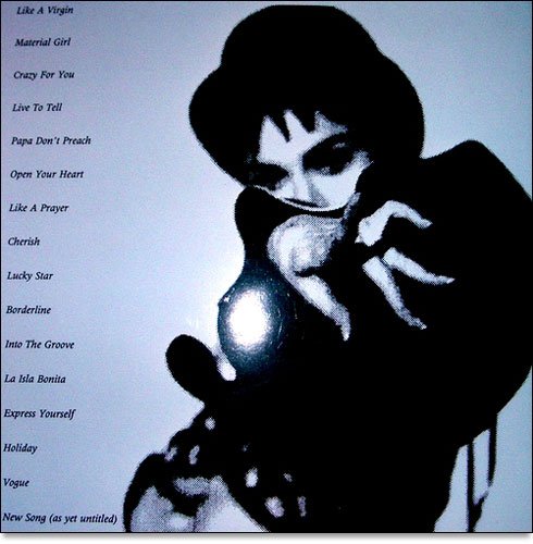
However, the two vast changes which ‘The Immaculate Collection’ underwent were the tracklisting and the cover design! Coming to the tracklisting you can see, from the following UK promotional press folder sent out to the media in anticipation of the collection’s release that the tracklisting was due to run non chronologically and the set was to feature only ONE new song, not two, as came to be the case upon release in November 1990.

It is unknown whether the one extra track was to be Justify My Love or Rescue Me as completed test pressings of the album from that far back are not known to exist, but considering the lead up time required for such a project, and the resultant lack of a video or any promotion for Rescue Me it is likely that the one extra track was Justify My Love.
 The most startling change which happened to the album though must surely be it’s sleeve design!
As every fan knows, Madonna did a daringly different photo shoot with legendary photographer and long time Madonna collaborator Herb Ritts for the album’s artwork, showing arty black and white shots of Madonna lurking about and larking about in a men’s restroom.
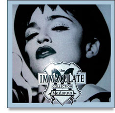
What most fans probably don’t know is the photo which was due to be the front cover was this design on the right.
Keen eyed readers will spot that this image ended up actually being the rear sleeve to the LP and CD releases, and the small logo designed by Jeri and John Heiden was meant to be a small shield design purely to house the title.
So, why was this most unusual shot of Madonna, with her newly collagen stuffed lips relegated to the rear of the sleeve and the Heiden’s shield image promoted to the entire front cover? Because Madonna decided, upon closer inspection of the image, that she looked (in her words) ‘too much like Mike Tyson‘!
Fact of the Day is brought to you by Tony from London
