| |
| |
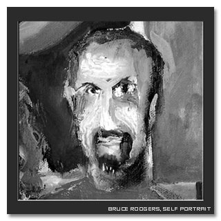
Bruce Rodgers was production designer for Madonna
and her Drowned World Tour. With his Tribe,
inc. he designed spaces that managed to match Madonna
artistically, keeping her persona, her music and her performance
in mind.
Bruce is a very private artist and usually
likes to let his incredible paintings and sketches speak
for him. This is just another reason that make us fell happy,
lucky and proud to have had a chance to meet him and to
talk about his life, his career, and the design process
that is so personal to him.
This story begings quite a few months ago with a note by
Bruce accompanying one of the sketches
he sent us: "Madonna is a very special
person". Read this interview and you'll know why Bruce
is a very special person, too.
|
|
 |
MadonnaTribe: Hi Bruce,
welcome to MadonnaTribe.
We use to ask our guest about how did their adventure
in the world of entertainment begin.
You once told a story about an eight-year-old wild Texas
child watching a behind the scenes special on "The
Planet of The Apes". Can we say that's the way it
all begun for you?
Bruce Rodgers: Thanks. Glad to answer
your questions although Drowned World seems so far away…
but thanks anyway.
Yes… I was allowed to do just about anything
I wanted when I was a kid including staying up late and
watching late late movies… so movies of all types
were part of my upbringing…
I think this is why my favorite film is sometimes "Cinema
Paradiso"! My father, who worked in a west Texas
movie theatre when he was a boy in the early 1940’s,
must have been happy when I fell in love with the movies
as a boy too.
MT: How do these roots
and childhood life influence your concepts and creations
as a professional nowadays?
I would say you incorporate some big echoes of the strong
force and stark shapes of your homeland's nature in your
designs.
|
|
| |
BR: I’m lucky to be in
a field of art that for the most part encourages abstract
thinking.
Unlike set design for theatre or film where the product
is dictated by story, music design allows artists to create
imagery based strictly on emotion. I believe every artist
brings the emotion of his roots, childhood, and upbringing
to the table. For me it may be the oilfield environment,
my religious upbringing, and the west Texas weather patterns.
|
|
| |
But I was also influenced by knowledge
of my distant relatives as I grew up. The older folks always
told us stories in our family about the past and we were
taught early on that life could be exciting, dangerous,
and fun.
MT: How did you happen to start working to stage
design, starting from an architectural background?
BR: Architectural studies are big on theory.
Once I started to really understand a few theories of design
in architecture school I became more aware of my real dream
and that was to work as an artist in set design.
The cool thing was that my architecture professors encouraged
my movements into theatre design and they even helped me
to use set design as the basis for my architectural thesis.
MT: The creation
of the AT&T Global Olympic Village for the Atlanta Games
in 1996 is one of your biggest professional achievements
but at the same time an experience tied to pain and sadness,
and also a turning point in your career as after that you
created Tribe, inc.
Have you been surprised by how fast things went on since
then?
BR: I was unaware
of the potential thrust that would come from being the production
designer of this project.
The AT&T Global Olympic Village was for me an answer
to many prayers. I always loved the Olympics and world’s
fair type events and I was thrilled to have a chance to
give AT&T an exciting design.
As the lead designer I put together an exciting support
team and we did our best to create a world-class pavilion
for the client.
|
|
| |
The fact that we were the location of
a terrorist attack would have been a sad ending to 2 years
of hard work by alot of good people. However, those same
people and millions more came together to keep the games,
and Centennial Park open for the remaining days of the Olympic
games.
|
|
| |
MT:
Let's talk about Ricky Martin's "Living La Vida Loca
World Tour".
That was the show that impressed Madonna so much to make
her ask you to be in charge of the stage design for her
upcoming world tour. But it was also a chance for you to
work with some familiar faces that have been working with
her for years.
What is your nicest memory of that Ricky Martin tour experience?
|
|
|
BR: There are so many great memories of the Livin
La Vida Loca design process.
This process was not a leisurely six-month design exploration.
It was a fast paced race to the first show!
From the moment I first sketched to the first show only
eight weeks had passed and yet this show design put a lot
of people on the map in our business.
I was asked by Jamie King, who was the choreographer behind
Ricky’s big Grammy performance, to come up with an
idea for Ricky’s tour.
Everyone knew this production was going to be big and fun
and I was excited to pitch my concepts.
When Jamie called I was in Washington D.C. working on "Brave
New World" with the Nightline production team.
I worked thru the night in my hotel room sketching while
listening to Ricky’s music on my headphones.
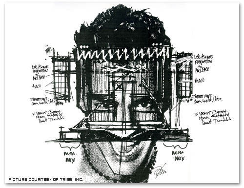
My first inspiration was a photograph of Ricky’s face
in Rolling stone magazine that I bought in a local grocery
store.
I thought it would be fun to use the proportions of his
face as the basis for the set.
As it turned out in the pitch Ricky understood and loved
the concept of the set being based on his face. He liked
the idea that lighting, effects, dancers etc, would be crawling
all around his head and knew it would be fun.
I think the nicest memory though happened when I was in
the first pitch meeting with Jamie and Ricky and all of
Ricky’s entourage a few days later in Miami.
In that first meeting I asked him in front of everyone to
name the four most important truths of his life.
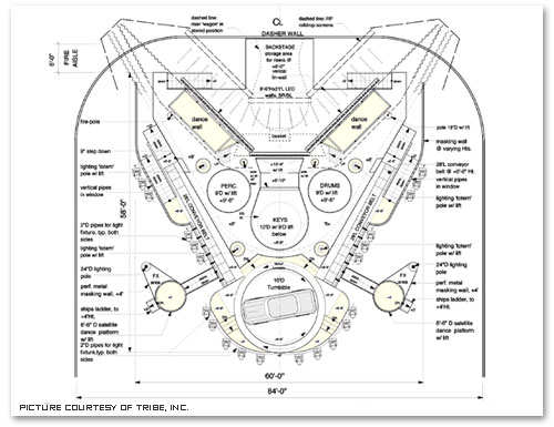
I wanted to have four totems lifts come out of the floor
for dancers to stand on. I wanted these towers to be icons
of Ricky’s emotions and beliefs.
I asked Ricky to list 4 special meanings in his life and
without hesitation he said: "life, love, music and
peace". He was very happy.
|
|
| |
I think he realized then and there
that we were the design team for him. But all in all I think
the set design was successful because it fit Ricky perfectly.
In this same meeting I was asked who would be the best lighting
designer for Ricky and I said Peter Morse… little
did I know I would be working with Peter many more times
in the future.
|
|
| |
MT: What are your
memories of the first time you met Madonna? That has to
be when you showed her your design for the 2001 Grammies
if I'm correct..
BR: Once again Jamie King asked
me for a design, this time for Madonna at the Grammy’s.
I was thrilled.
Jamie mentioned that Madonna loved my design for Ricky’s
show and that it gave her great motivation to tour again
and that if everything worked out we would move into the
tour design. Because time was short I quickly created a
huge painting that had a huge holographic limousine, red
white and blue glitter and Madonna on a mechanical bull.
Jamie did the entire interface with her so he showed her
the sketch in a private meeting.
|
|
| |
I do remember that when I dropped off the sketch
Jamie was wearing gold pointy shoes specifically for his
meeting with her. (Hmmmmm- I thought maybe I should buy
some.)…
I didn’t actually meet her until the first Grammy
dance rehearsal. When we met I said "hi" and
she said she loved Ricky’s design and I said thanks
and that was it.
Then she went and rehearsed her dance performance for
hours and hours and hours.
MT: You were not very familiar with Madonna before
the tour process started and you once said you filled
your CD player with her music while working and sketching
the concepts.
As a Madonna fan I admit I'm very curious and intrigued
about how the experience of facing so much Madonna all
at once was like, it may have been quite good, or simply
overwhelming, or maybe a punch in the stomach, you tell
me...
BR: I was familiar but not a real follower.
I always looked at her from a distance and thought she
worked hard to come across as really smart and creative.
I guess I liked her but I’m not a dancer so her
music didn’t connect with anything I was about.
My mind mentally blocks the words of songs for some reason
and I tend to remember sounds of songs rather than any
words. (Lately I have managed to slowly grasp the poetry
of some songs thanks to my work with Sting who is a very
special poet/musician that I was lucky to work with.)
Because the Madonna Grammy performance was so successful
I was in a very positive creative zone when I started
sketching for her.
I bought all the music I could find and after several
hours I could tie the vibe of the songs to different areas
of a design.
Then after I had my thumbnails and basic storyboards in
place I started painting.
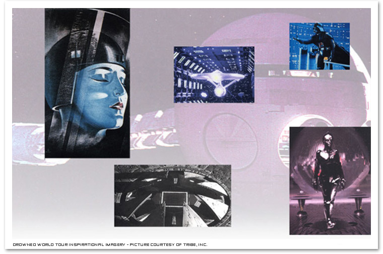
MT: Discussing your work on the "Drowned
World Tour" on Entertainment Design back in 2001
you said that you sketched out concepts starting from
an outline made of the four acts and one encore: Act I,
"Madonna wants to arrive in a spaceship"; Act
II, "Kabuki Theatre/Crouching Tiger Hidden Dragon
- style with a tree"; Act III, "White trash
with a mechanical bull"; Act IV, "Latin/Gypsy";
and the encore, "Music".
Do you have an act/scene you enjoyed the most working
on?
BR: I love the conceptual phase of the
design process. It’s really exciting to find the
relationships of all the acts/scenes and to have them
live with each other and take part and support each other
in simple and strong ways.
|
|
| |
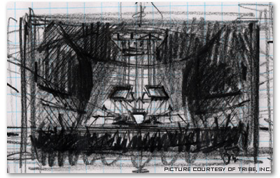
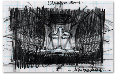
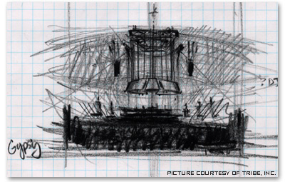
For instance I decided that the spaceship was also the lighting
rig, the main set was a temple with crazy Escher stair steps
and the dance boxes for the white trash dances were incased
into the temple wall steps, the temple had led walls which
worked like garage doors in a sense that they could raise,
they could also be danced on, etc etc.
I was happy with all the elements that worked together but
most importantly I think the design is successful because
it fit Madonna’s message perfectly.
|
|
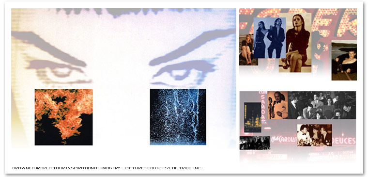 |
| |
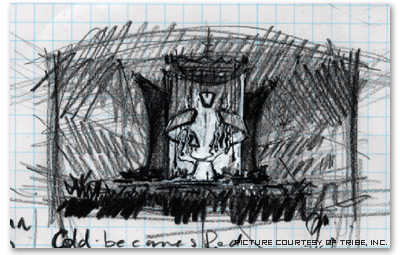
MT: The Drowned World Tour was Madonna's
comeback to the live show experience after a number of years,
bringing a lot of excitement and anticipation.Many were
surprised by how dark the show looked like in the end but
we know that Madonna had changed a lot and the new show
was meant to reflect her new life and state of mind.
Was it a big challenge to turn such a strong statement into
an equally strong stage design?
I understand you didn't have many meetings with Madonna
during the design process but what you created certainly
reflected her completely.
|
|
|
BR: As I mention above I totally absorbed
myself in her music and with the outline of the acts I managed
to create something that worked and made her happy.
I was very aware of this being an important comeback for
her and at the same time I saw it as a chance to do a more
spiritual setting than she had used before. Even though
it was dark its form was temple-like and strong, positive,
useful, and deep. I think I totally channeled Madonna and
gave her what she would have created herself if she were
able to draw.
MT: The Drowned World Tour was also the first Madonna's
tour to be entirely performed in arenas, what was the impact
on the design, of having no curtain and no actual separation
between the stage and the audience, and people sitting 270°
around?
BR: Great question! For me the experience in an
arena, in 270 or 360-degree sightlines, is the most intimate.
Feeling the raked audience almost wrap around a 270 set
is really exciting to the audience because you can see people
such as yourself having the experience of their lives. That
feeling is contagious and religious!
Although I used a wrap around show curtain on Ricky’s
270 design I didn’t need one for "Drowned World".
I suggested the audience walk in with the arena dark and
with the ‘space ship/ lighting rig’ down on
the stage deck ready to lift off and up during the opening
number.
MT: The video imagery in the "Drowned
World Tour" were created by Dago Gonzàlez, one
of the talents you had already worked with on the Ricky
Martin tour. How would you describe the role of the LED
screens in the "Drowned World Tour" and how is
it working with Dago?
BR:Working
with Dago on Ricky was a great experience and I knew he
would be involved in the Madonna show.
That is a big reason I designed led tiles and led walls
into every aspect of the set.
He told me he was worried about how he would make it work
but he did a great job. At the time no one had used led
tiles separately as just tiles and no one had used different
shapes and aspect ratios of led walls, also- no one had
led walls that were flown or moved into position for effect…
but I looked at led video tiles as architectural/sculptural
pieces rather than movie screens… and I thought it
was future thinking to have temple walls and space ship
facades emit video imagery.
This all created a sort of "organic led" architecture.
I also created the idea of the small led wall that is downstage
center being sort of an all seeing eye of Madonna, a shakra
of sorts that could lower to mask and reveal dancers and/or
Madonna.
It’s funny. I just read an interview with one of my
favorite lighting designers who does all of U2’s work
and he is very proud of the video walls in his shows ("Pop
Mart" and "Zoo") as if he invented the concept
of visuals and large scale moving imagery but I can remember
experiencing the same scale of moving image at drive-in
movie theatres in west Texas watching KING KONG kick GODZILLA’S
ass in the middle of an actual Texas rainstorm and I think
now WOW THAT LOOKED REAL! ...hmmmmmm U2’s shows are
great and top of their game and congrats but please - were
they the first, were we with Madonna’s shows first
to fly dancing kabuki fighters to music… No!... we
are all just artistic continuations of the life and design
cycle we all live in.
MT: Light designer Peter
Morse was a sort of veteran of the Madonna tours. How was
working with Peter?
Did he give you any advice taken from his years of work
with Madonna?
BR: Peter is a gentleman and a brave lighting
designer. Having worked with him on Ricky for the first
time, it was great to see someone with that much knowledge
goes to work.
|
|
| |
He gave so much to the production without direction
and where there was direction he made magic and made the
director look like a genius. Lighting designs are really
like another character in the performance and it helps that
Peter is an accomplished musician.
I can’t say enough good things about Peter.
|
|
| |
MT: Peter described you
as a genius and your set designs as "very much into
the 21st century very futuristic and aggressive".
"Futuristic and aggressive" are terms that are
used quite often in reviews, articles and interviews about
your work and Tribe, inc. But I noticed that your design
is also strongly inspired by ancient architecture and the
masters of modern and organic architecture...
BR: I love ancient dirty architecture and I love
clean modern design.
At it’s best my field of design is inherently ancient/modern
for a few reasons.
|
|
| |
Our industry’s
audience and performers demand the most modern and cutting
edge technology…and there is a massive amount of
competition to bring the best show to the people for the
biggest payoff.
That’s the modern part.
The ancient part is the fact that real people actually
build these shows... which
creates a real essence of manmade old world ancient presentation
in a modern setting. It’s the most exciting form
of design on the planet!
I think people lose site that men make architectural,
engineering, technological, and medical wonders. But live
performance always delivers that ancient manmade feeling
directly to the audience every time.
MT: You use a lot of curved lines and
shapes in your designs. This gives a strong sense of space
and depth to the stage.
Is this an heritage coming from your architectural o scenography
masters?
BR: I think more from the scenography
masters. I think my designs have used all forms that are
derived from the music and the type of venues we play.
But I actually learned some simple basics of perception
from my first scenic design professor, Dr. Forrest Newlin…
he showed me tricks that the old master artists used to
create depth and movement in human form and architecture
in paintings and sculpture.
For instance layering dark forms in front of light forms
in front of dark forms, the use of contrapuntal formations
and analysis, the use of off kilter
perspectives, the use of contrapposto when sketching people,
striking lower depth points of views in renderings, using
exploded scale, creating resistance between the solid
and transparent, creating tension and compression between
far and near horizon lines, using people to effect scale,
etc.
|
|
| |
Copyright 2005 MadonnaTribe
Pictures and sketches courtesy of Tribe, inc
|
|
|
|
|

